1 (edited by kierownik 2008-04-17 15:09)

Topic: admin menu

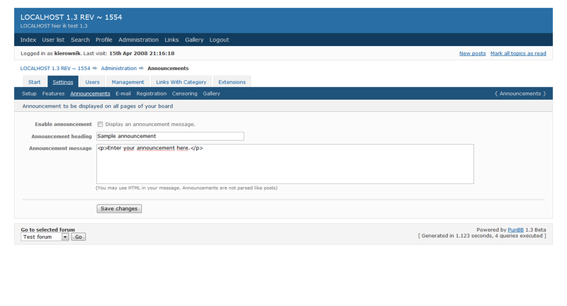
Would it be better to show the line of

LOCALHOST 1.3 REV ~ 1554 -> Administration -> setup

change to

LOCALHOST 1.3 REV ~ 1554 -> Administration -> settings -> setup

just like I do with my new extension:
New:
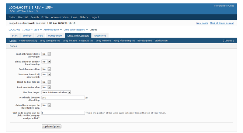
http://i147.photobucket.com/albums/r319/kierownik/FireShotcapture11-Opties-LinksWithc.png

Old:
http://i147.photobucket.com/albums/r319/kierownik/FireShotcapture12-Announcements-Adm.png

[edit]Do not look at the REV number, I just did not change that, I am at 1594 now smile [/edit]

Re: admin menu

I dont see the point. You can see from the coloured tab what the sub-menu is. No harm in addding it I suppose, but its not really a deal breaker. tongue

Re: admin menu

no it is not, but it will be clearer to see if someone makes a style and there you cannot see it wink smile

Re: admin menu

Good point.

Re: admin menu

Done

6

Re: admin menu

I had the same conversation with Rickard a long time ago and for some reason he wanted it as it is.

Re: admin menu

Mmm, feel free to revert if you want

Re: admin menu

Thanks Smartys, but now it is only for settings and not the rest!

Re: admin menu

lol, when I read your post that was all I thought you were talking about. tongue
I'll change it if Rickard says it's OK.

10

Re: admin menu

That first photograph worries me. Thats too many sub menu items. Narrow the width and it will fall apart. If we are going to get people extending the menus like that then the horizontal sub menu might need a rethink.

Re: admin menu

Mmm, how does Wordpress manage to do it? They have a somewhat similar design and I just tested resizing, which very nicely broke the submenu items into two lines.

12

Re: admin menu

A horizontal submenu which breaks nicely is easy to do. The difficulty comes when you use a nested listed for the submenu which is the most accessible way of doing it. I will have to experiment a little I think.

EDIT: WP uses two seperate lists which is the easy and robust way to do it.